Table of Contents
Running a WooCommerce store is exciting and full of potential, but here’s the catch: many store owners focus on the big things like products, pricing, ads, and traffic, while the smaller conversion-boosting details often go unnoticed.
Things like:
- Poor product variations
- Confusing product galleries
- Missing interactive elements
- Lack of visual clarity
These tiny mistakes may seem small, but they create unnecessary friction and friction is one of the biggest conversion killers. The good news? Almost all of these issues can be fixed without hiring a developer or redesigning your entire store.
In this article, we’ll walk through the most common WooCommerce store owner mistakes and show you how to fix them using smart, user-focused solutions including a few helpful tools from StorePress. So take a breath, relax, and let’s improve your store step by step.
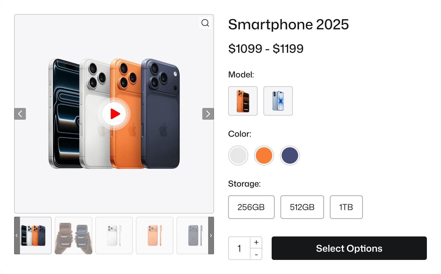
Mistake 1: Using Default Dropdown Variation Options
Many WooCommerce store owners never touch the default variation settings. They leave everything as it is. So, when a customer goes for selecting a product variation, he shows nothing but a boring dropdown.
Model: 2025 Pro, 2025 Pro Max
Color: Silver, Cosmic Orange, Deep Blue
Storage: 256GB, 512GB, 1TB
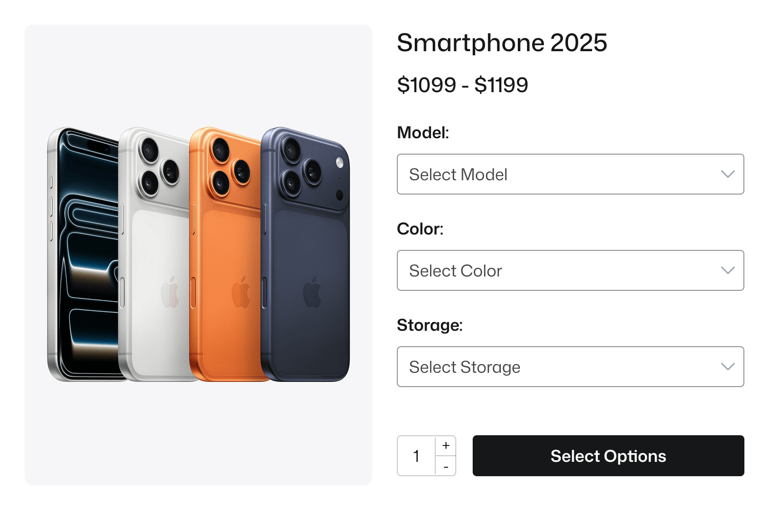
- No visual preview
- No excitement
- No emotional push
And buyers scroll… scroll… then leave. Because online shoppers buy with their eyes not from a dropdown list.
Imagine yourself as a buyer. Would you confidently buy a T-Shirt if you’re not visually sure about the color or style? Probably not.
Why This Happens
Many store owners assume that default dropdown variations are “fine.” But in reality, they can be a hidden conversion killer.
This is especially true for stores selling mobile devices, clothing, fashion items, cosmetics, jewelry, furniture, handmade goods, or anything where color, pattern, material, or style matters.
Dropdown-based choices often create confusion and hesitation instead of clarity, leaving customers uncertain and less likely to complete a purchase.
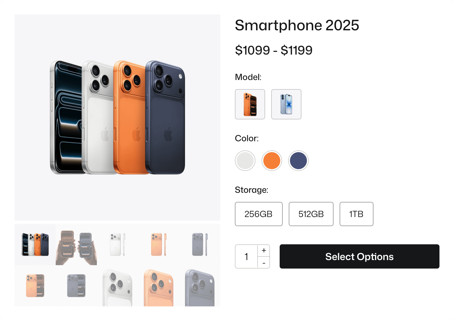
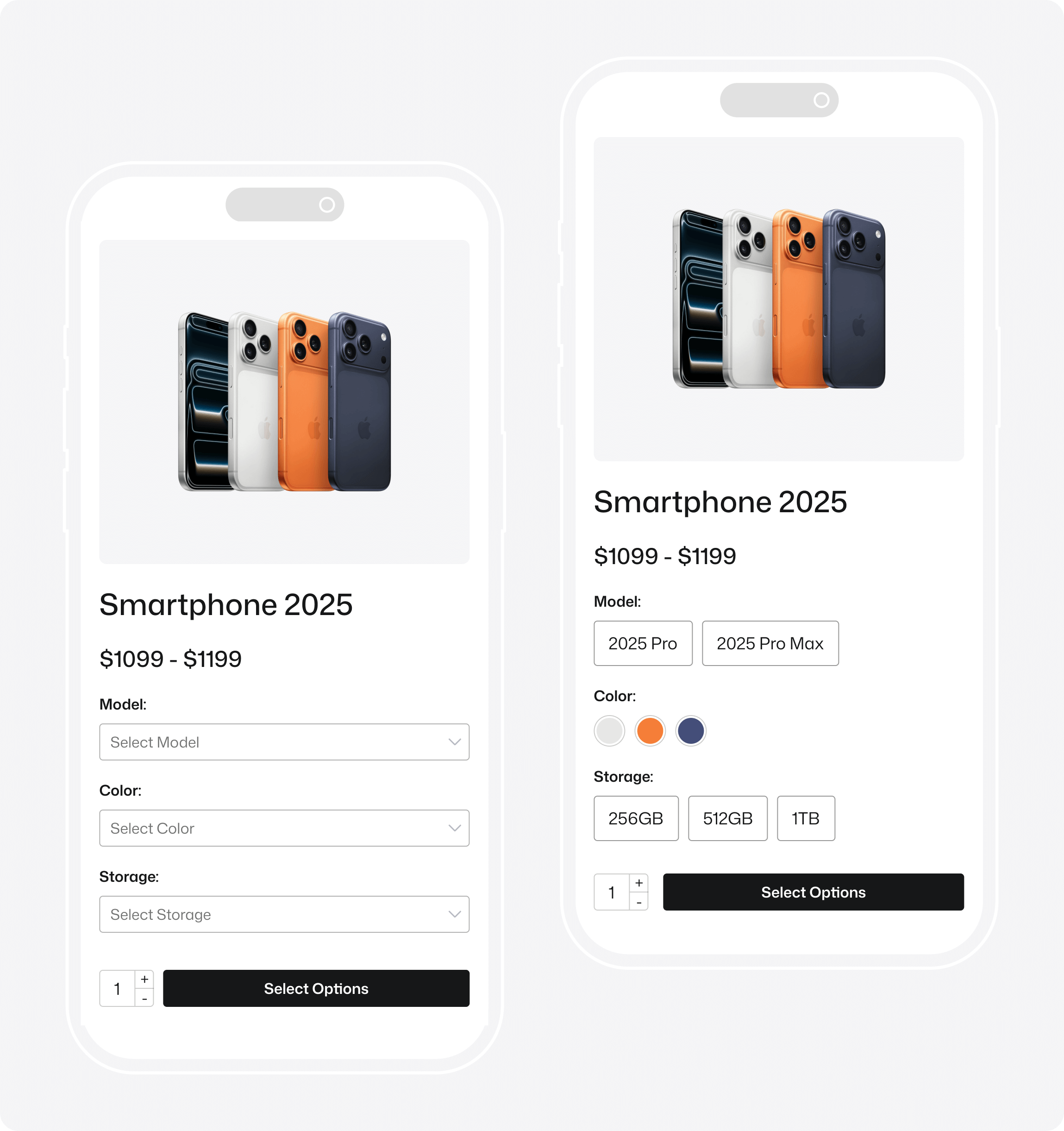
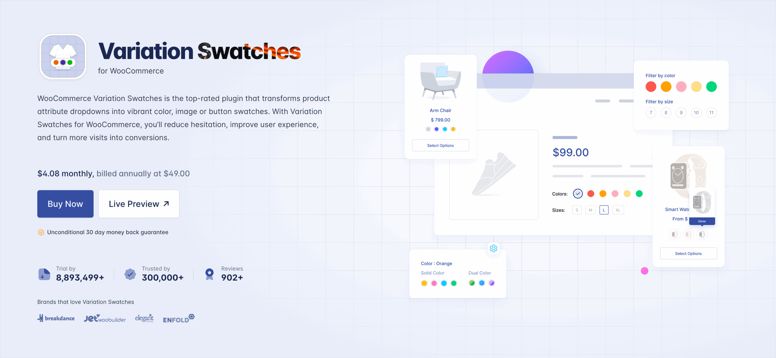
How to Fix This (Using StorePress Plugin)
This mistake disappears the moment you replace standard dropdowns with visual variation swatches. With WooCommerce Variation Swatches by StorePress, you can display colors as swatches, show textures and patterns visually, highlight variation labels clearly, and make the selection process clean, modern, and intuitive, reducing the steps between interest and purchase.
Instead of plain text, customers can instantly see product options like sizes, materials, fabrics, and styles. This visual clarity builds confidence in their choice and confidence naturally drives higher conversions.

Real Impact
Stores that move from default dropdowns to visual swatches notice:
- Higher engagement
- Lower cart abandonment
- Faster decision-making
- Improved buying experience
Because shoppers instantly see; not guess.
“When the buying process feels easy, people buy more.”
Mistake 2: Poor Product Image Presentation
Here’s a hard truth: people don’t physically touch products online-they rely entirely on images. Yet, many WooCommerce stores still make the mistake of showing only one product image, using low-quality photos, or failing to match images with variations.
Without multiple angles, zoom options, or alternate views, customers struggle to understand the product fully. They can’t compare textures, judge quality, or be confident about what they’re actually buying.
This is one of the most common yet overlooked mistakes WooCommerce store owners make. Ignoring it can directly affect trust, reduce conversions, and ultimately hurt sales.
Why This is a Problem?
Customers today expect the same clarity and detail as they get on Amazon, Zara, H&M, or IKEA. Whether they’re checking a ring, a sofa, a hoodie, or a lipstick, they want the ability to zoom in and inspect the product closely.
They also expect multiple angles and real-life context to understand exactly what they’re buying. If your product gallery doesn’t deliver this experience, the sale simply won’t happen.
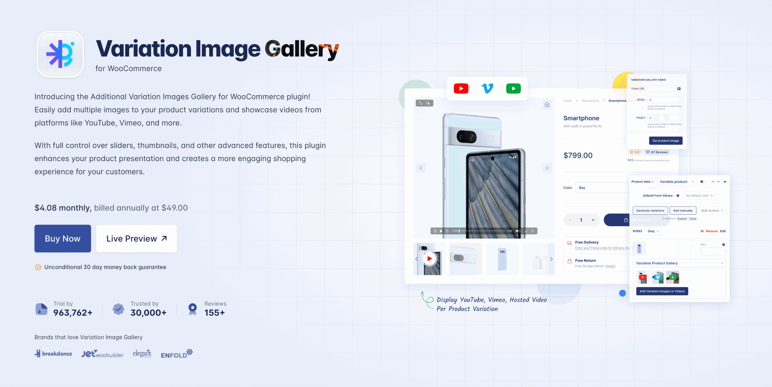
How to Fix This
Using WooCommerce Variation Gallery by StorePress, you can completely transform your product media experience and build instant trust with your customers. This plugin lets you add multiple images per variation, show a dynamic gallery that updates instantly, and display real-life as well as close-up shots.
By doing this, your products feel more premium, and customers gain the clarity they need. No more showing the same image when someone switches between variations. Instead, customers see new color images, fabric textures, different angles, or wearing styles.
Result?
When product images align with customer expectations:
- Conversion rates go up
- User confidence increases
- Return/refund requests drop
- Time spent on product pages increases
And that’s exactly what a growing WooCommerce brand needs.
Mistake 3: No Visual Support When Switching Product Variations
Another common mistake many WooCommerce store owners make is not updating the product gallery when customers select a different variation.
Here’s what typically happens: A shopper selects a new color, size, or type but the product images stay the same.
- No visual change
- No confirmation
- No reassurance
And that moment creates doubt. When the product doesn’t visually respond to customer actions, the experience feels disconnected and incomplete.
Why This Hurts Sales
Customers expect instant visual feedback.
If someone is choosing:
- A white smart-phone vs. a black one
- A velvet sofa vs. a leather sofa
- A matte lipstick vs. a glossy one
They want the image to change accordingly. If it doesn’t, they start questioning things like:
- “Is this the right color?”
- “Does the variation look different?”
- “What exactly am I buying?”
- “What will arrive at my doorstep?”
When people hesitate, they delay their decision. Delayed decision often leads to cart abandonment.
How to Fix This
With the WooCommerce Variation Gallery plugin by StorePress, your product gallery updates automatically based on the selected variation. When a customer switches color, texture, material, or style, the images update instantly, reflecting the exact choice.
This creates a more intuitive and responsive shopping experience. Products feel more real, selections feel accurate, and customers gain the confidence they need to complete the purchase. The purchase feels intentional; not risky.
The Impact You Can Expect
Stores that implement interactive variation galleries typically see:
- Higher average time spent on product pages
- Fewer doubts and support questions
- Improved buyer confidence
- Noticeably higher conversion rate
Because when customers see exactly what they are buying, the friction disappears.
A confident buyer is a fast buyer.
Mistake 4: Not Using Interactive Product Engagement Elements
Most WooCommerce stores rely only on basic images, text, and pricing. But modern shoppers expect more than a static product page. They want interaction, clarity, and an engaging experience.
When a store fails to offer visual context or interactive exploration, products feel flat and lifeless If customers can’t understand the details, benefits, or hidden features visually, they lose interest.
Why This Problem Exists
Most store owners think simple photos are enough. But the reality is: People don’t read long descriptions unless something first captures their visual curiosity.
A static image can’t always convey every detail. If customers are unsure, they hesitate and hesitation often stops a purchase.
How to Fix This
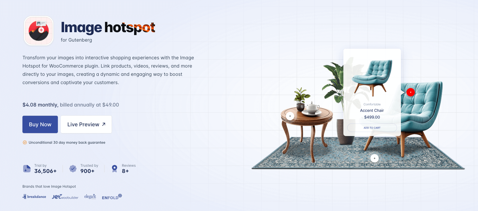
This is where Image Hotspot for WordPress becomes a powerful tool. Instead of a plain image, you can make your product interactive.
With hotspots, shoppers can:
- Hover or click on small markers
- Learn about product features
- See benefits clearly
- Explore details without scrolling or guessing
For example: Instead of saying:
“This sofa includes storage compartments.”
A hotspot allows the user to discover it visually, exactly where the feature exists. This turns browsing into a guided experience. Customers feel smarter, informed, and confident.
The Result
Interactive product visualization leads to measurable improvements. When shoppers can interact with the product, they connect with it emotionally, not just logically.
Mistake 5: Ignoring the Mobile Shopping Experience
Most WooCommerce store owners design their website while sitting at a laptop or desktop.
But here’s the truth many forget: A large percentage of online shoppers buy from mobile devices.
If your product variations, image galleries, or interactive elements don’t work smoothly on mobile, the buying journey becomes frustrating. And frustration quickly leads to one outcome: The user leaves.
Why This Becomes a Problem?
On mobile, every interaction needs to feel effortless. If users have to zoom in, scroll endlessly, or tap multiple times just to reveal product details, the experience quickly becomes frustrating. Small dropdowns and poor interface elements create friction and friction kills interest.
Mobile shoppers expect clarity, speed, and responsiveness, not effort. When images load slowly or the design forces visitors to work harder than necessary, they lose patience and move on. A seamless mobile shopping experience isn’t optional anymore rather it’s a requirement.
How This Applies to Your Store
Even if your store looks “fine” to you, it may still feel slow, cluttered, hard to navigate, unclear, or not optimized for conversions.
This is especially true when it comes to product variations and visual presentation. If the shopping experience feels heavy or difficult, customers often abandon their carts not because the product is bad, but because the experience isn’t smooth.
How StorePress Helps Fix This
All three StorePress solutions-WooCommerce Variation Swatches, WooCommerce Variation Gallery, and Image Hotspot for WordPress are fully optimized for mobile shopping. Variation swatches stay clean and easy to tap, image galleries adapt perfectly to smaller screens, and hotspots remain readable and interactive without creating clutter.
This makes navigation simpler and the entire product page more intuitive. A seamless mobile-first experience reduces drop-offs, keeps customers engaged, and ultimately drives more conversions..
The Real Impact
When a product page is designed with mobile users in mind, you’ll notice faster product selection, higher engagement, smoother interaction, better customer confidence, and stronger conversion rates.
Convenience isn’t just expected on mobile, it’s an opportunity to create a smooth, enjoyable shopping experience that naturally leads to more confident purchases.
Mistake 6: Not Using Clear, Persuasive Content or Visual Confidence Signals
Many WooCommerce stores rely only on basic product titles and short descriptions, but modern customers expect much more clarity before making a purchase decision. Today’s shoppers want information that’s useful, visual, and easy to digest, not just text.
If your product page lacks clear benefits, social proof, visual explanations, strong value messaging, feature breakdowns, or visual validation, customers begin to feel uncertain. And when uncertainty enters the buying journey, conversions drop instantly.
Store owners often assume:
“If the customer wants it, they’ll figure it out.”
But online buyers don’t have sales reps, product demos, fabric samples, or trial rooms. They rely entirely on what they see and what they understand quickly.
If the product page doesn’t explain the value visually and clearly, customers stop caring even if the product is genuinely great.
How StorePress Tools Help Solve This
Your product page can present information more clearly and visually using our plugins:
WooCommerce Variation Swatches:
- Customers instantly understand options like color, texture, style, or material
- No extra explaining needed
- Visual choices reduce confusion and build trust
WooCommerce Variation Gallery:
- Customers can see what changes when they make a selection
- Every variation is supported by real visuals
- Clarity feels effortless
Image Hotspot for WordPress:
- You can explain product features visually
- Highlight fabric type, stitching, compartments, technology, or material
- Customers learn without scrolling through long text
These tools build trust through visual guidance; not just written descriptions. Because when customers understand the product quickly and clearly, the decision becomes easy.
Mistake 7: Treating Experience as an Afterthought, Not a Priority
Let’s be honest for a second. Most store owners think the hard part is building the website.
Once it’s live, they believe the store will just work. But here’s the reality: People don’t buy products , they buy experiences.
And in eCommerce, experience comes from the journey:
- How products feel visually
- How variations behave
- How the store responds to interaction
- How easy it is to understand the product
- How confident a buyer feels before clicking “Add to Cart”
When the experience isn’t thoughtfully designed, customers sense it immediately even if they can’t explain why. They just leave, sometimes silently.
Conclusion: Small Fixes, Big Impact
These are the top 7 WooCommerce Store Owner Mistakes that our experts picked for you. If you have anything to say or need our consultation, please feel free to contact with us by leaving a comment here. We will try our level best to provide the best support you need right now.
Sometimes, small improvements make the biggest difference. And if you ever need expert help optimizing performance, driving conversions, or scaling growth, a one-stop digital marketing agency like SerpTale can guide you in the right direction.
Remember, Running a WooCommerce store isn’t just about great products, it’s about how smoothly customers can explore, understand, and trust what you’re offering. Small issues like unclear variations or poor mobile experience can quietly slow down conversions.
![Top 10+ Best WooCommerce Product Gallery Slider Plugins [2026]](https://storepress.com/wp-content/uploads/2025/11/WooCommerce-Product-Gallery-Slider-Plugins.webp)